The current Eso Won Books website
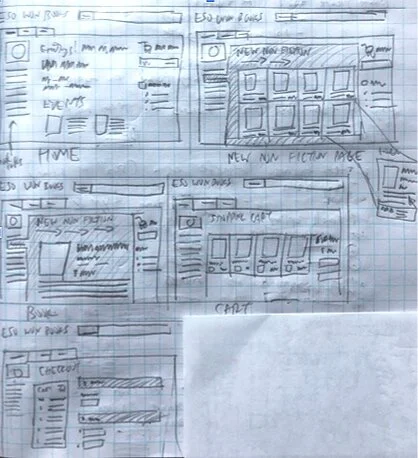
A sketch of what the revised Eso Won Site would look like
IMPROVING E-COMMERCE TO EDUCATE THE HISTORY OF THE AFRICAN-AMERICAN STRUGGLE
A Better Eso Won website to better educate contemporary America
Duration: 2 week sprint
Role: UX Research, Prototyping and Design
Methods Applied: Persona, Usability Testing, Comparative & Competitive Analysis, Wireframing
Programs Used: Figma, Whimsical
I got to redesign an existing e-commerce site to make the site more aesthetically-pleasing and easy for the user to browse, filter, and purchase a book. I had to look at the current website of an existing bookstore called Eso Won Bookstore. It is dedicated to selling literature dealing with the history of African-Americans.
The site layout was not very clear knowing where to start and there were so many fields to fill out that the user will most likely lose interest.
PERSONA DEFINED
BUSINESS ANALYSIS
I did a business analysis of the Eso Won site to find what is interactively wrong and found the following:
It was visually difficult to navigate in order to subscribe and find a certain book
The items just have a summary, price, ISBN, author(s), and title
The field forms are long and asks for more information than required.
I redesigned the Eso Won site to make it look clean, streamlined, and ensures all the information is provided to assist the buyer in finding the desired book.
COMPETITIVE ANALYSIS
A competitive analysis was used to look at other related sites and see what features those sites used to keep interest:
I looked at other online bookstore sites like Barnes & Noble and an ethnic bookstore called Arkipelego Books and studied the visual placement of its links, tabs, images, and menus to see if it makes the ordering process easy for the user.
Both sites like Barnes & Noble and Arkipelego books have a better, pathway to selecting and purchasing a book and its menu are in a tile format to see more items in one page.
Amazon has a good hierarchical structure of categorizing all its items and it’s laid out in an “F pattern” where its main links are on the left and it branches out into sub-categories to filter its items.
Arikpelago Books, a Filipino-American Studies online bookstore, displays its items in a tile, columnar format
Site Map of the New Eso Won site
Hovering on a book to show its details before selecting it
ESO WON NEEDS A FACELIFT
After reviewing the old Eso Won site, I revised it and had it tested for other people to try by asking them to find a certain book, review it and place an order.
I changed the layout of how the items are displayed from its original stacked appearance when you scroll the site into a columnar grid appearance. This format also provides more images to be displayed when viewed on screen.
If you hover your mouse on your selected book, it shows a pop-up that displays not just the title, price, and image of the book but also the 1-to-5 star rating, synopsis, and review of the book. The user can open the pop-up if the user is interested and will take them to another page that will show more information, accolades, and reviews of the book before making a purchase.
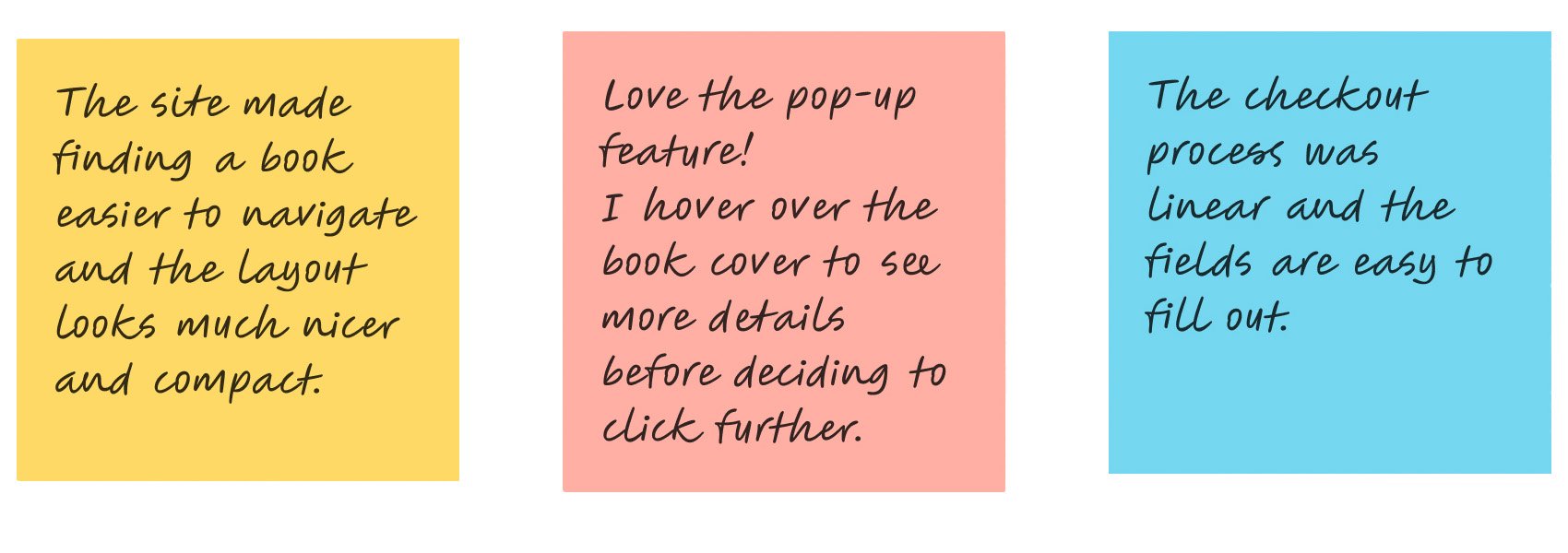
When I had my users try out my revised Eso Won site, I got positive responses:
WHAT DID I GAIN FROM THIS?
Doing this project for a bookstore aimed to educate the accomplishments and awareness African-Americans have contributed to the advancement of the United States made me feel like I was helping in making African-American History more accessible to all.
Overall, this was a good experience where I get to apply not only my graphic design capabilities to redesign and compartmentalize certain aspects of an existing website but also look and analyze the flow of the user experience of the site.


